The best way to read the Enchiridion.
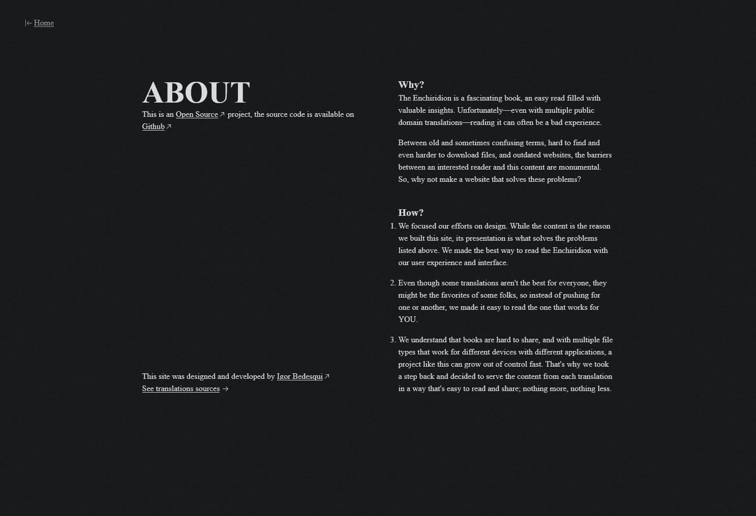
The Enchiridion is a fascinating, easy read filled with valuable insights. Unfortunately—even with multiple public domain translations—reading it is often a bad experience.
Between old and sometimes confusing language, hard to find and even harder to download files, and outdated websites, there are too many barriers between an interested reader and the book.
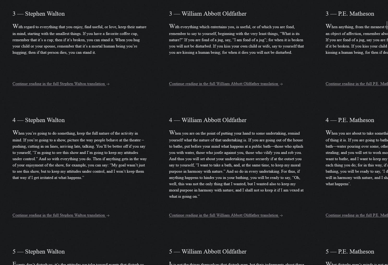
The Manual addresses these issues trough a carefully crafted web experience, enabling frictionless reading of a variety of translations.
Design direction
While the content is the focal point of the site, its presentation is how we solved the problems listed above. Balancing the tension between the simplicity of “just text on a page” and the limitless possibilities of the web, I choose to take inspiration from print and offer an almost “Just text” experience, where interactive elements fade in as you reach for them but don’t disturb your reading.
The “Reading progress” flow best exemplifies these interactive elements; Nothing is said as the user reads a translation, but when they visit the homepage again, a subtle text indicates their reading progress. If they choose to read the same translation, an option to continue from where they left off appears. My goal was to make this a “wow moment” inspired by video games that sets the tone of the site, “things will work without getting in your way”.
The recent dark theme update follows the same “show, don’t tell” pattern by choosing a theme based purely on system preferences, and a “highlights” feature is planned in the public roadmap .
Visual design
The visual design of the site exaggerates the print aesthetic and feel by heavily borrowing defining characteristics and working within carefully built constraints:
- Links have directional arrows, going to translations is represented by pointing to the right, and going towards the landing page is represented by pointing to the left, mimicking the turn of pages in a book, forward to the content, and back to the index.
- No “HUD-y” menu, the site needs navigation but it felt right to put links along the body of the document, contextualizing them and allowing users to explore “paths” through the book.
- No “button-y” buttons, clickable elements with clearly defined borders and backgrounds felt out of place in a book. Instead, I made deliberate use of underlined text for links and icons for various interactions.
- No pure black or white, shades of tinted gray feel more real, and with a grainy overlay achieve a paper-like look.


Technical details for nerds
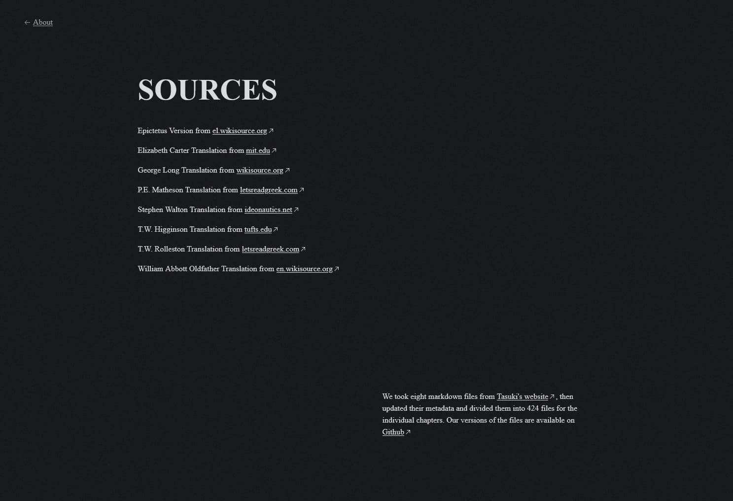
Before writing any user-facing code, I spent some time playing with golang to transform 8 translations into 424 markdown files . Then, wrote other scripts to bulk-edit these files and their metadata as needed .
I approached development from a static-first angle, the site is usable with javascript disabled and on pretty much any device, it even . Leveraging Astro I generated hundreds of pages for translations, chapters, and comparisons using data from the markdown files to populate a few templates.
For the interactive bits, I used islands of Solid.js and scripts with no framework. Deploying on Vercel meant sub-minute build times even with 490 pages, including the monstrous “compare all translations” page with 13200 DOM elements. Additionally, tailwindcss allowed me to colocate styles and markup without sacrificing functionality.
Other relevant technical details include: Prefetching of next pages based on user interaction, resulting in snappy navigation for an Multi Page Application, relocation of analytics script to web workers via Partytown , and build time image optimization to speed up the site.
For further details, refer to the source code available on GitHub .
Type of work
- FrontEnd Developer,
- UX/UI Designer
Personal
Tools
- Typescript,
- Astro,
- SolidJS,
- TailwindCSS,
- Partytown,
- Golang,
- Vercel
2022